
Responsive Websites = Success
- By Brian Lewis
- •
- 01 Jun, 2022
- •

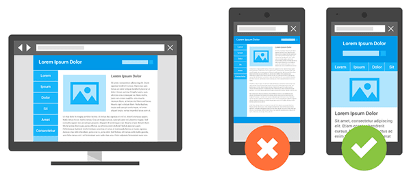
Whether you’re on your computer, tablet, or phone, more and more companies are starting to focus on creating the best visual experience across different multi-screens in order to provide a custom experience among their customers. The best way they can achieve this is by making their websites “responsive”. A responsive website is one website that is optimized for desktop, tablet, and mobile.With a responsive design you can read, navigate and interact with a website on the device of your choice without having to zoom in or out. This means that a website will adjust it’s presentation in order to be easily viewed through different devices.
If a company wants success, “responsive” is the way to go!
The trend of responsive web design sites is becoming popular nowadays. Users are more adjusted to view a company’s website or any of their products through multiple screens. A visitor’s first impression of a company’s website is crucial because it is the deciding factor as to whether or not they’ll use your services or products. The majority of a company’s first initial users will use a mobile or tablet device to visit a company’s website due to the convenience since most users will have a mobile or tablet device on hand.
The average person will use multiple screens to accomplish a task or look for information 90% of the time. Here are some of the advantages of having a responsive website:
- Reach a bigger audience
:
- 77% of users have research a product or service on their device; 46% of smartphone users have made a purchase on their phone.
- 67% of users start shopping on one devices and continue to another
- 65% of shopping occasions are started on a smartphone
- 34% of users turn to the screen that’s closest when looking for information
- Your customers are already mobile, so stay in touch with them
:
- 10% – 30 % of you users are coming from mobile or tablet devices. When a company doesn’t offer a mobile friendly version of their website, they will most likely lose customers.
- Going responsive allows a company to keep with customers and engage them whenever possible
- You’ll only have one website to maintain
:
- The beauty of having a responsive website vs just a mobile friendly version is that you only need to maintain one set of pages. That means that any changes or new functionality you offer to the desktop version will automatically transfer over to your mobile as well.
- Offer a consistent design across all devices
:
- A responsive website can help a company maintain a consistent visual design across multiple devices rather than users seeing different “look and feel” of your company on different devices.
- Stay in front of the competition
:
- Since responsive websites are still relatively new, having one puts you one step ahead of your competitors.
- You’re preparing now for the future
:
- The era of strictly desktop web searching is ending with mobile web searching is taking over the reigns. It is estimated that by 2017, more than 5 billion people will use mobile phones.
- Google loves it responsive websites! :
- Recently Google has declared that they prefer responsive web design over separate mobile and desktop websites. This is due to the efficiency of using a responsive websites since one single URL, instead of around 3 – 5 different URLs, is used across multiple screens. This makes it easier for Google to search a site for relevant content which allows responsive websites to generally rank higher in search results.
Isn’t mobile friendly the same as responsive web design?
Unlike responsive, mobile friendly versions aren’t the optimized mobile versions of your site, but actually a completely different site. It’s a separate site companies build to look good solely on your mobile device. Here are some of the disadvantages of using a mobile friendly version:
- It doesn’t look on every device
:
- Mobile friendly version usually look good from a smartphone, but nowadays users aren’t accessing your site with just a smartphone. New devices are popping up at every turn. Since it isn’t optimized, your site won’t look the same across multiple devices.
- It spreads out your SEO ranking
:
- SEO is essential in the growth of your company! It helps higher your ranking on Google, making you easier to find among users looking for your services or products. Since you’ll have twice the links, information, and content, Google spreads the SEO you’re trying to optimize.
- Users are re-directed to irrelevant pages
:
- Not every page on a company’s site has a mobile friendly version created for it. This means that a user may be directed to a 404 error page, your homepage instead of the page requested, or the desktop version of your site. This can lose the interest of the viewer and potentially reduce your audience.
How do I make a responsive website?

There are two ways to create a responsive website:
- Create a custom design from scratch, code, that you can make responsive
- Use a responsive theme
Creating a custom design that is responsive requires a solid understanding of code and code-related application, which could be something that a new company doesn’t have the luxury of. An easier way to ensure that your company has the best possible response website is by using a responsive theme. WebAct has a vast number of responsive themes you can use to ensure your company is ahead of the competition. Visit WebAct today and learn more about our responsive theme along with our other services.
We are one of the Top Denver Web Development Companies in Denver according to Design Rush.
-
![WebAct Web Services]()
-
![WebAct Web Design]()
Design
GET A NEW LOOKFrom modern websites to stylish logos to full branding packages, our design team has the skills and experience to make your vision a reality.
-
![WebAct Marketing]()
Marketing
GET BETTER RESULTSOur conversion driven marketing strategies are customized to your budget and optimized to help your business grow.
-
![WebAct Do It Yourself Website Builder]()
Do It Yourself
TRY IT FOR FREEWant to tackle your business' web presence on your own? We have the tools and technology to help you grow your business on a budget.
-
![WebAct Duda Pros]()
-
![WebAct White Label Partners]()